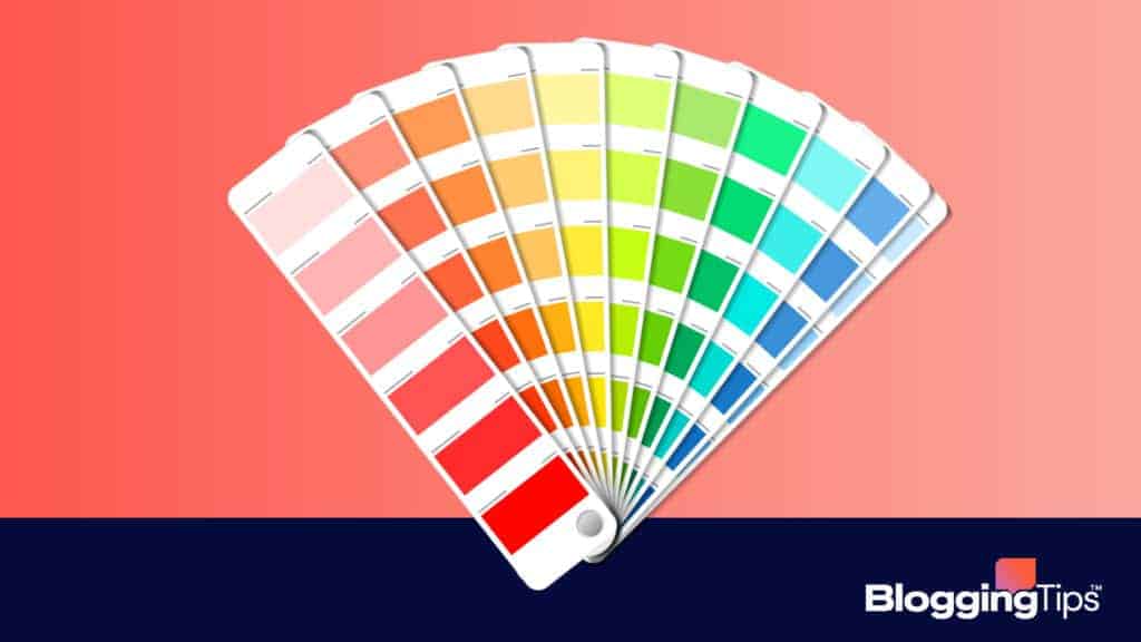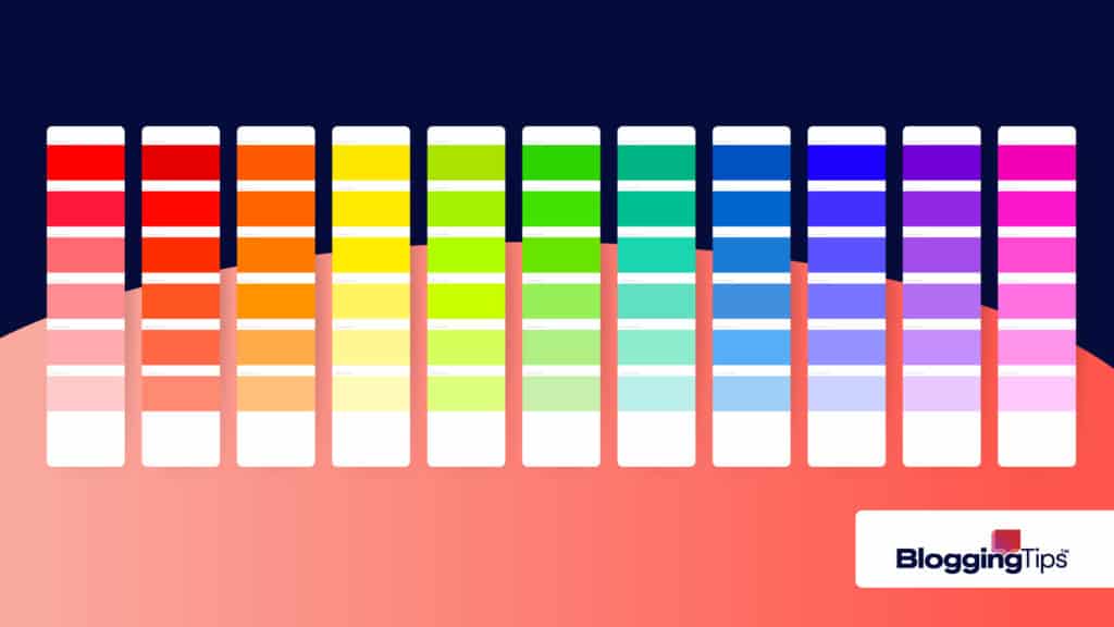
If you have ever seen one of the videos of a color-blind person putting on glasses that allow them to see color for the first time, you know exactly how impactful color is on human beings.
In each of these videos, the color-blind person weeps with joy when they see color for the first time.
The sheer joy and emotion they are feeling at that moment demonstrate why color is so important to us.
Colors have a tremendous impact on us, and different colors can drastically impact our mood and behavior.
This article examines what colors are, why they are essential, and the psychology behind them.
Keep reading to find out the most popular colors and how they impact us.
What Are Colors and Why Are They So Important in Life?
We see color because of our eyes.
As light bounces off objects, our eyes pick up that light.
The light waves hit the retina at the back of the eye and stimulate the optic nerve.
From there, those signals travel to our brain, where we process what we see.
But what exactly are colors?
Colors are simply different wavelengths of light.
When all the different colors mix, we see white light.
When no colors are present, we see black.
You can break down the color spectrum into primary and secondary colors.
Primary colors are colors that cannot be created by mixing other colors.
The primary colors are red, yellow, and blue.
Secondary colors are created by mixing primary colors.
The secondary colors are green, purple, and orange.
You can organize primary and secondary colors in a color wheel.
The secondary colors are located between the two primary colors that mix to create the secondary color.
Now that we know what colors are, let’s look at why they are so important to us.
Warm and Cold Colors
You can break down colors into two categories, warm and cold.
Warm colors like red, yellow, and orange give a sense of heat and warmth.
Warm colors will appear closer than they are.
Cold colors like green, blue and purple are calming and relaxing.
They are often associated with nature.
Cold colors appear further away.
Mood and Behavior
Colors can have a profound impact on our mood and behavior.
For example, red increases our heart rate and makes us feel more energetic.
Blue, however, is known to have a calming effect.
Colors can also impact our appetite.
Studies have shown that the color red can suppress our appetite while the color yellow can increase it.
And colors can also impact our emotions.
The color black is often associated with sadness, while the color white is associated with purity and innocence.
However, not everyone reacts to colors in the same way.
Our reaction to colors has a lot to do with our social and cultural upbringing.
For example, white is associated with purity and innocence in most Western cultures.
However, in many Eastern cultures, white is the color of mourning.
The color red also has different meanings in different cultures.
In China, red is the color of good luck and prosperity.
In India, red is a sacred color often used in religious ceremonies.
In the Western world, red is often associated with danger and anger.
The different meanings of colors illustrate how our social and cultural upbringing primarily influences our reaction to colors.
Now that we know what colors are and why they are essential, let’s look at the most popular colors.
What Are the Top 5 Most Common Favorite Colors?
The most popular colors are blue, green, purple, red, and orange.
Your favorite color says a lot about your personality.
Blue is the rarest color in nature which explains why it may be so appealing.
The color blue indicates calm and peace, and many men prefer it.
People who like the color blue tend to be responsible and serene.
It also means you are a giver instead of a taker and listen well.
Green is most commonly associated with nature.
It symbolizes growth, new beginnings, and fertility.
People who prefer green tend to be creative, down-to-earth, and environmentally conscious.
Purple is a scarce color in nature which explains its luxurious feel.
The color purple indicates royalty, power, and wealth.
People who prefer purple tend to be creative, imaginative, and reflective.
Red is the most visible color in the spectrum, which explains why it is associated with danger and emergencies.
The color red also symbolizes energy, passion, and action.
People who prefer red tend to be outgoing, impulsive, and confident.
Orange combines the two most visible colors in the spectrum, red and yellow.
The color orange is often associated with happiness, success, and motivation.
People who prefer orange tend to be optimistic, extroverted, and good communicators.
These are just a few popular colors and what they say about your personality.
It’s important to remember that our social and cultural upbringing primarily influences our reaction to colors.
So, take the time to learn about the different meanings of colors in different cultures before deciding on your favorite colors.
What Are the Most Popular Colors in 2022?

Just as music and fashion trends come and go, so do color trends.
Each year there are new colors that become popular.
New popular colors can result from culture, events, and our experiences as human beings.
Paint is often a good indicator of the year’s popular colors.
Paint color will change based on societal trends.
Cars are also a good indicator of popular colors.
Each year there is a new popular car color.
The most popular colors for 2022 are gray-green, earth tones, citron, deep aubergine, chartreuse, and warm neutrals.
Gray-green is a popular color because it mixes two of the most popular colors, gray and green.
It symbolizes balance and stability.
People who prefer gray-green tend to be practical and down-to-earth.
Earth tones are also famous for 2022 and include brown, tan, and olive green.
They are associated with nature and the outdoors.
People who prefer earth tones tend to be loyal, reliable, and hardworking.
Citron is a yellow-green color that is said to boost energy and vitality.
It is also associated with good health and wealth.
People who prefer citron tend to be optimistic, extroverted, and good communicators.
Deep aubergine is a dark purple color associated with power, royalty, and wealth.
People who prefer deep aubergine tend to be creative, imaginative, and reflective.
Chartreuse is a yellow-green color that is said to promote mental activity and stimulate the appetite.
People who prefer chartreuse tend to be intelligent, quick-witted, and resourceful.
Warm neutrals are colors that are not too bright or too dark.
They are associated with comfort and relaxation.
People who prefer warm neutrals tend to be calm, stable, and reliable.
The popular colors of 2022 are a significant change from 2021.
In 2021 the most popular colors were blues, greens, and oranges.
The Psychology of Color in Marketing
The psychology of colors in marketing is essential when choosing the colors for your brand.
Colors can influence our emotions and how we perceive a brand.
Does Color Affect Marketing?
The short answer is yes.
Colors are one of the most critical aspects of marketing.
They can influence our emotions and how we perceive a brand.
For example, blue is often associated with trustworthiness and reliability, making it an ideal color for brands that want to convey these qualities.
On the other hand, red is often associated with energy and excitement, making it an ideal color for brands that want to convey these qualities.
What Colors Are Positively Associated With Marketing?
The most cheerful colors in marketing are blue, green, and purple.
These colors are associated with trustworthiness, stability, and royalty.
The most successful colors in marketing are blue, green, and purple.
These colors are associated with trustworthiness, stability, and royalty.
The most popular colors in marketing are blue, green, and purple.
These colors are associated with trustworthiness, stability, and royalty.
Can Colors Influence Sales?
The answer is yes. Colors can influence sales.
For example, red has increased sales by up to 34%.
Frequently Asked Questions
These are some frequently asked questions about the most popular colors.
What color is the human eye most attracted to?
The human eye is most attracted to the color green.
Green is the color of nature, symbolizing growth, health, and new beginnings.
What color do guys like most on a girl?
There is no specific answer to this question.
It depends on the guy’s personal preferences.
What are children’s favorite colors?
There is no definitive answer to this question.
However, blue, red, pink, and purple are all popular colors with children.
What are the most famous colors?
The most favorite colors are blue, green, and purple.
These colors are associated with trustworthiness, stability, and royalty.
What is the rarest favorite color?
The rarest favorite color is green.
Green is the color of nature, symbolizing growth, health, and new beginnings.
Why is blue such a popular color?
Blue is a popular color because it is associated with trustworthiness, stability, and royalty.
Wrapping Up
Thank you for reading this article.
We hope it helped you learn about the most popular colors of 2022 and the psychology of colors in marketing.
As you can see, colors tremendously impact our emotions and psyche.
They can also profoundly impact how people perceive brands and marketing strategies.
It is important to keep up with the color trends.
If you have questions, please feel free to ask them in the comments section below.


Responses