
Imagine spending hours writing your blog posts or spending thousands of dollars to outsource blog writing only to get no traffic.
Many things could be the culprit, but one of those is poor blog design. Fortunately, that’s a problem that you can fix.
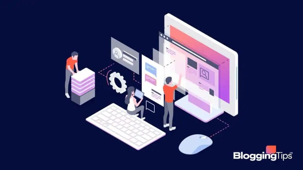
What Is Blog Design?
Blog design refers to the visual appearance of a blog or website. It covers the colors, fonts, and layout of blog posts, images, and other blog content.
You can use a template or theme to create a simple blog design. However, you may want to customize the theme or template to develop a design that you want.
Things that make for a good blog layout include:
- Focus on the content
- Easy to navigate
- Easy to read
- Well organized
- Use of categories and tags
Blog posts should be easy to find and read. Many blogs include a search bar so that visitors can find exactly what they need. It’s also important to include a list of categories to help readers narrow their search.